KDT 포스코X코딩온 웹 풀스택 과정 10기

- CSS [높이 너비, border, box-sizing, 요소를 숨기는 3가지 방법, overflow]
- 다양하게 CSS 사용하여 실습하기
- postion
- z-index
- CSS background
- 레이아웃의 꽃 display:flex
2023-10.27 ~ 2023.10.28
📚 CSS
📌 높이 너비
[width, height, max-widht, max-height]
- width : 너비 (px, em, vw 등 단위 )
- height : 높이 (px, em, vw 등 단위 )
반응형 웹 작성 시 많이 사용하는 [max, min width, height]
- max-widht 최대 가로 너비
- max-height 최대 세로 너비
- min-widht 요소가 작아질 수 있는 최소 가로 너비
- min-height 요소가 작아질 수 있는 최소 세로 너비
- calc() 사용자가 원하는 크기 값을 계산
ex)
| width: calc(30vw-100px); |
- line-height : 글자의 줄 높이
코드 1줄인 경우 box-height, line height 값이 같으면 중앙정렬
📌 border
[border-width, border-style, border-color]
borer-width : 선의 크기 px, em, % 등
border-style : 선의스타일 none (defulat 값), solide (실선)
border-color : 선의 색상 선택
boder : (선크기) (선종류) (선색상)
| border: 1px soild black; |
border-raidus : 박스에 끝 모서리 부분을 깎는다.

각각 방향마다 설정도 가능하다. 설정방법은
border-raidus: 0 10 0 0; - 위에서부터 시계 방향이다.
📌 box-sizing
[content-box, border-box]
| box-sizing : content-box; box-sizing : border-box; |

- 요소 크기 계산 기준 지정
- content-box 기준 : 안에 내용까지만 width , height 계산
- border-box 기준 : 테두리까지 width , height 계산
📌 요소를 숨기는 3가지 방법
[opacity, visibility, display]
| opacity : 0.5; visibility : hidden display : none |
opacity : 기본값 1
모습만 숨기는 방법 / 속성 남음 / 자리 차지
뒤에 있는 요소가 클릭이 불가능하다.
visibility : hidden
모습과 속성을 숨기는 방법 / 자리 차지
뒤에 있는 요소를 클릭할 수 있다.
display : none
그냥 없애 버리는 방법 / 자리도 사라진다.
이벤트 작동 안 함.
📌overflow
[visible, hidden, scroll, auto]
요소의 크기 이상으로 내용이 넘쳤을 때, 보임을 제어하는 단축 속성
| overflow : hidden |


visible : 넘친 내용 그대로 보여줌
hidden : 넘친 내용을 잘라냄
scroll : 넘친 내용 있는 경우에만 잘라내고 스크롤바 생성
auto : 넘친 내용 있는 경우에만 잘라내고 스크롤바 생성
📚 다양하게 CSS사용하여 실습하기

2023.10.28
📌postion
[static, relative, absolute, fixed]
| position : relative |

static : 정적 위치 지정 방식 (기본값)
relative : 상대 위치 지정 방식
absolute : 절대 위치 지정 방식
fixed : 고정 위치 지정 방식
📌 z-index
1. position 속성의 값이 있는 경우 위에 쌓인다.
2. 1번 조건이 같은 경우, z-index 속성 숫자에 값이 높은 경우 위에 쌓인다.
position이 static 값이면 z-index가 높아도 통하지 않는다.
position속성의 값으로 absolut, fixed 사용하면 inline -> block 변경된다.
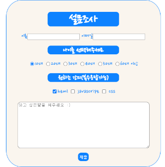
📌 지금까지 배운 것을 사용하여 실습하기

📚 CSS background
📌 background-color
- 배경을 꾸미는 요소이다.
linear-gradient() 그라데이션으로 배경색을 넣어준다.
background : linear-gradient (방향, 위에서 아래)
- 색상 1 | 색상 2
- 방향 | 색상 1 | 색상 2 : 해당 방향으로 색상 2개 지정 (ex, 45 deg blue red)
📌 background-image
- 요소에 배경이미지 삽입
| background-image: url("이미지경로"); |
📌 background-repeat
| background-repeat : repeat; |
[ repeat repeat-x repeat-y no-repeat]
repeat : 이미지를 수직 수평 반복
epeat-x : 수평 반복
repeat-y : 수직 반복
no-repeat : 반복 없음
📌 background-position
[top, bottom, left, center 방향 / px, em, rem 단위]
| background-position:top, right; |
📌 background-size
- 배경 이미지 크기 설정
[ auto cover, contain / px, em, rem 단위]
| bacground-size:auto; |
cover : 더 큰 사이즈 쪽으로 맞춰준다.
contain : 더 작은 사이즈 쪽으로 맞춰준다.
📌 background-attachment
- 배경 이미지 스크롤 특성
[local, scroll, fixed ]
| background-attachment:local; |
local : defalut 값
scroll : 요소가 스크롤될 때 배경 이미지가 같이 따라 움직인다.
fixed : viewport 기준으로 이미지가 고정된다.
📚 레이아웃의 꽃 display:flex
📌 flex
부모에게 flex를 주게 되면 자식들이 수평정렬된다.
| display: flex; |
📌 flex-direction
부모에게 설정한다.
[row, row-reverse, column, column-reverse]
| flex-direction:row; |

속성
row 행(가로) 축 (좌-> 우)
row-reverse 행(가로) 축 (우-> 좌)
column 열(세로) 축 (위-> 아래)
column-reverse 열(세로) 축 (아래->위)
📌 flex-warp
내부 요소가 꽉 차면 다음줄로 넘겨준다.
[nowrap, wrap]
| flex-warp:nowrap; |

📌 justify-content
주 축의 정렬 방법
[flex-start, flex-end, center, space-between, space-around]
| justify-content:flex-start |

📌 align-items
교차 축의 한 줄 정렬
[stretch, flex-start, flex-end, center, baseline]

📌 align-content
wrap인 경우 사용한다 여러 줄일 경우에 가능
[stretch, flex-start, flex-end, center space]

오늘은 다양한 CSS 속성들을 알아봤다. 다양하게 배경을 꾸밀 수 있는 background, 순서를 내 맘대로 변경할 수 있는
z-index, 레이아웃의 꽃이라고 불리는 flex, flex는 정말 다양하게 사용할 수 있는 게 많은 만큼 처음은 많이 헷갈린다.
그래서 자주 사용해 가면서 익숙해 질수밖에 없다. 나중에 flex를 사용하여 nav bar를 만드는 연습을 해보겠다.
'국비지원 > 부트캠프' 카테고리의 다른 글
| [KDT 포스코x코딩온 10] 웹 풀스택 과정 회고록 (6) | Javascript (2) | 2023.11.01 |
|---|---|
| [KDT 포스코x코딩온 10] 웹 풀스택 과정 회고록 (5) | Javascript (2) | 2023.10.31 |
| [KDT 포스코x코딩온 10] 웹 풀스택 과정 회고록 (4) | CSS (0) | 2023.10.30 |
| [KDT 포스코x코딩온 10] 웹 풀스택 과정 회고록 (2) | HTML,CSS (0) | 2023.10.25 |
| [KDT 포스코x코딩온 10] 웹 풀스택 과정 회고록 (1) | HTML (0) | 2023.10.25 |


